Add Options to Your Theme
You can design your theme so that some aspects of it can be globally changed. For example, you might want site owners to be able to turn search off and on, or determine how to align the menu. Or you might want them to be able to change the color or size of something. These choices are created with options and controlled with styles.
In this topic:
About Theme Options
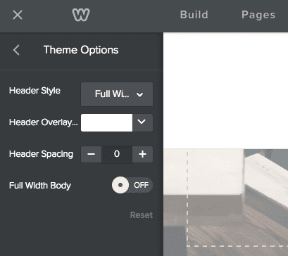
When a Weebly theme includes options, users can configure them from the sidebar of the Theme tab in the editor. For example, the theme shown below allows the user to change aspects of the header.
You can create the following types of options:
- Toggle (as shown in the Full Width Body option, above): Turns the option on or off for the site.
- Dropdown (as shown in the Header Style option): Choices are provided from a dropdown list.
- Color (as shown in the Header Overlay option): Choose a color to change some color aspect on a page. You must use LESS for your styles if you use this option.
- Pixel (as shown in the Header Spacing option): Change the size of something on a page.
- You must use LESS for your styles if you use this option.
When you create a dropdown option with a number of values, then the classes will be the name of your option followed by -<option value> For example, if you create an option named header-style that determines the header style to use, and you define the choices to be full-width or boxed, you'd end up with two classes to be styled: header-style-full-width, and header-style-boxed.
The color and a pixel option are controlled with LESS variables whose name is created based on your option name. For example, if you created a color option named header-overlay, you will have a variable named @header-overlay to hold the chosen value. A pixel option named header-spacing will have the @header-spacing variable available to hold the value of the height. You must use LESS for your theme styles if you want to use these options.
Create Options
You configure theme options in the manifest JSON file where you declare the option, it's type, default value, and if a dropdown type, the allowable values (including the default). The name that you give the option, along with the value of any choices, are used to create CSS classes or variables that can be styled.
Define the following properties for each option:
Define the following properties for each option:
- name:
Name of CSS class or variable that will be used to reference this option.
The name cannot have spaces.
- title:
The name that displays to the user in the editor. - type:
Specifies the option type. Choose from one of the following:
toggle: The option is either on or off
dropdown: The user makes a choice from a list. If you use this, then you must also create choices properties.
color: The user chooses a color.
pixel: The user sets a pixel size. - default:
The default value. Each type has a different type of default:
toggle: Either true or false. If no default is set, true will be used.
dropdown: One of the values configured in the choices property. If no default is set, the first choice will be used.
color: A hex value
pixel: Don't use default. Instead, you can optionally set min and max properties to define a default size. - choices:
Only needed for dropdown types - create an array of value/title pairs for each choice. value is used to create the CSS class/variable to represent this choice, while title is used in the editor. - is-body-class:
Set to true for toggle and dropdown types. Set to false for color and pixel types.
Creates a class based on the option name and attaches it to the body tags used in the site. This class allows you to style based on the selection. - is-less-var:
Set to true for color and pixel types. Set to false for toggle and dropdown types.
Creates a LESS variable based on the option name, allowing you to style any selector that includes the variable.
Option Examples
Say you want to create an option that turns the nav bar on and off.
Here's what the manifest entry might look like:
Here's what the manifest entry might look like:
Nav Bar Option Manifest Entry
Here's what the entry in the main_style.css or main.less might be:
Hide the Nav Bar
And here's how it displays in the editor:
Here's a manifest example showing one of each type of option:
Theme Options in Manifest
Your LESS stylesheet might then contain the following entries using the classes and variables created for the options.
For another example, check out our Base LESS theme example.
Theme Options in LESS Stylesheet