Create a Dashboard Card
You create a default version of your dashboard card in your app's manifest. This version is what users will see when they first install your card. You then provide updates that change the card using our API. The updates are JSON blobs that contain the changes to the card. These updates need to occur when we request them (normally when the user visits their Site Home page) and also when the data they display changes significantly enough to warrant an update. You may also want to update a card based on the user's experience with your app. For example, at the beginning, you may want to display Welcoming and onboarding information, but later replace that with data.
Whether you are creating the default version of a card, or updating a card, you need to define your card's components and set their properties. See each individual component topic for property details and design considerations.
Whether you are creating the default version of a card, or updating a card, you need to define your card's components and set their properties. See each individual component topic for property details and design considerations.
In this topic:
Implement OAuth and Add Scopes
For your dashboard cards to POST to our endpoint and display data, and so that you can access the Card API, you must implement OAuth. When configuring the manifest, be sure to include the scopes your card needs to access or write to user's data).
Subscribe to the Dashboard Webhook
Webhooks allow you to respond to events that happen in Weebly. The dashboard.card.update webhook will be sent to you every time a user visits their Site Home page and again whenever they close a dashboard card takeover. You need to respond to this webhook by performing an update. In order to receive the webhook, you must subscribe to it.
Define the Dashboard Card
In your manifest file, you need to create the default card that all users will see when they install your app. Add the dashboard_cards element as a root element in your manifest and then set the properties shown in this table.
Property |
Type |
Description |
Required? |
name |
String |
A unique name for the dashboard card. The name is not displayed, but is used for ID purposes only. You can use alpha or a mix of alpha and numeric characters, but the name can't be all numerics. 25 character max. |
yes |
version |
String |
The version of your card. Provided as a string, following Semantic Versioning guidelines (Major.Minor.Patch: for example 1.5.13). Note: If you version your card, you must also version your app at the same incrementation. |
yes |
label |
String |
Text to display in the header. The app's name is always displayed. The text entered for this property will be appended to the app's name. Only set this if your app has more than one card and you need to differentiate them. |
no |
icon |
String |
Relative path from the root of the app directory to an SVG icon that displays in the header. The icon must be 60x60. |
no |
link |
String |
URL to content that displays in a takeover when the user clicks the header of the card. Can include a JWT token to pass in the user_id, site_id, and iat properties. Must use the HTTPS protocol. The content in this takeover (as opposed to takeovers opened by the individual components) should be summary information for the app as a whole. Note: Dashboard cards can only link to takeovers within Weebly. However, you can include links in the takeover content that links to an external site. Note: All URLs must use the HTTPS protocol. You will not be able to upload an app that uses HTTP. |
no |
default |
Array |
The default representation of the card as defined by the child component properties. If you pass in an empty array, no card will be shown until new information is passed via the API. See the individual component type topics for more information about the component properties. |
yes |
An entry for a dashboard card for MyApp might look like this:
Dashboard Card Manifest Entry
Add Components
Now you can add components to your default card. Components display in the same order they appear in the manifest. See the individual component topics for more information about using each component.
- Text: A line or two of text - good for a tip or promotions.
- Link: Text with a link to a takeover. You can optionally set a style, such as alert, that changes the styling of the text.
- Stat: A single statistic (usually a number) with an optional secondary display that can be either a sparkline chart or a delta.
- Action: A clickable button or link with an actionable icon that opens a takeover.
- Welcome: Onboarding info to guide the user to a setup process for your app. This component takes up the whole card - no other components display with the Welcome component (unless on another pane of the card).
- Event: A time-based event.
- Progress: Displays a progress indicator.
- Group: Groups two or more components together with an optional label.
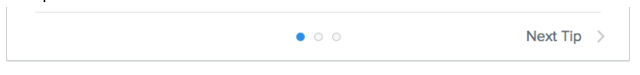
Add Panes
You can add another array of components within a parent array to create a second pane in the card. When you have more than one array of components, the card displays navigation controls that allow a user to scroll through the panes.
This code example shows how you might create two panes.
Creating Panes in a Dashboard Card
Add Navigation in Takeovers
Takeover pages, whether the takeover for the main card, or a takeover for one of the card's components, are HTML pages that are served from a site of your choosing. You can add JavaScript to any takeover page allowing users to navigate from the takeover to the Weebly editor, or to publish their site.

You use the windows.postMessage method, taking either editor or publish as the message property, and https://www.weebly.com as the targetOrigin URL property.
For example, to navigate to the editor, you might do this:
Navigate to the Weebly Editor
To publish the current site, you might do this:
Publish the Current Site
Design Considerations
Keep the following in mind when building your dashboard cards:
- Cards should be kept simple and clean, directing the user to the takeover for more detailed interactions and data. Before adding new components, consider whether the user will see great value from the addition of it.
- Cards should typically not exceed 400 pixels in height.
- Although an app can have multiple cards, and each card can contain multiple panes, these features should rarely be used, as we encourage you to keep cards very simple. Any apps submitted with multiple cards or panes will be heavily scrutinized during the review process to ensure the functionality is truly needed.
- We pass the locale of the user to you when requesting an update to the card. It's your responsibility to provide localized content to the user.
Update Data on the Card
By default, dashboard cards are refreshed and the data reloaded every time the user visits the Site Home page, and and whenever the user closes the card's associated takeover. At both these times, Weebly sends the dashboard.card.update webhook. You will need to decode and verify the webhook hash in order to view the data, which includes the following:
Webhook Received for Card Update
Locale is provided so that you can send back localized versions of the card. When you receive this request, you must POST an update to the given card, using the API token you received during the OAuth flow when the user installed the app.
You can also update a card whenever you need to post new data (you should not always wait for a request from us). Consider updating the card if new data needs to be displayed. However, if that data is likely to change often throughout the day, it may make sense to do a bulk update periodically, rather than each time the data changes. More on the Card API here.
Your POST needs to include the following JSON blob:
JSON BLOB to Update a Card
The hidden property determines whether or not the card should be displayed on Site Home. You might decide to hide a card if a user is not using a particular part of your app. The card_data property contains all the properties for each component. Both of these are optional so that you can hide or show a card without changing the contents. You only need to include the card(s) being updated.
An update overwrites the existing card, so include all components and properties that you want to display. Because it overwrites, you can create a completely new looking card through an update - you don't need to create a new card. This is especially helpful when your default card defined in the manifest is a Welcome component. On an update you can replace the Welcome component with components that display data.
An update overwrites the existing card, so include all components and properties that you want to display. Because it overwrites, you can create a completely new looking card through an update - you don't need to create a new card. This is especially helpful when your default card defined in the manifest is a Welcome component. On an update you can replace the Welcome component with components that display data.
Note: Always use the manifest to create the default version of your card. Use the API only for updates.
Package, Upload, and Test Your Card
Your dashboard cards are packaged and uploaded with your app. If you've previously released an app without dashboard cards, you'll need to version your app in order to add them. And if you version your card, you need to also version your app. Be sure to thoroughly test your cards as you would your app, and be sure to follow the card-specific policy requirements checklist.
Link to Takeover Content
You can directly link to any of your takeover content. For example, if you've created a Welcome component whose takeover displays important onboarding information, you might want to link directly to that takeover from a corresponding Welcome email.
You can use the card_id to link directly to the card's takeover (the one that displays when you click the heading). The URL is weebly.com/home/[card_id].
You can use the card_id to link directly to the card's takeover (the one that displays when you click the heading). The URL is weebly.com/home/[card_id].
Related Topics
What are Dashboard Cards?
What are Dashboard Cards?