Theme Design Guidelines
When you create a Weebly theme, your design needs to support the functionality found on the pages in the different areas of a Weebly site, as well support the elements often used on a site. For example, blog pages expect certain content and elements, while pages that display products expect something different. Because users can easily switch between themes, you need to make sure that you follow these guidelines and requirements to ensure switching between themes is a smooth transition.
In this topic:
Page Guidelines
Weebly sites have different areas and pages in those areas need specific content. These areas include:
Variables in partial files (.tpl files) provide the content needed in each of these areas. Only the variables currently on the partial are supported, but you can rearrange the content. The main.less file for the theme contains sections with styles for each of these areas. Review the current styles to learn the different classes and element IDs, and change as appropriate. But be sure to include styles for items noted here.
- General: Pages like Home, About, and Contact fall into this area
- Blog: Blog pages have functionality like listing blog posts and comments
- Search: Search results need to display and potentially be filtered.
- Commerce: Pages in this area display products and categories and the checkout flow.
- Navigation: This area is on every page and allows the user to jump from one page to another.
Variables in partial files (.tpl files) provide the content needed in each of these areas. Only the variables currently on the partial are supported, but you can rearrange the content. The main.less file for the theme contains sections with styles for each of these areas. Review the current styles to learn the different classes and element IDs, and change as appropriate. But be sure to include styles for items noted here.
Layout Types
Weebly pages (no matter the area) can use one of three different default header layouts. You need to provide HTML templates and styling for each header layout you want your theme to support
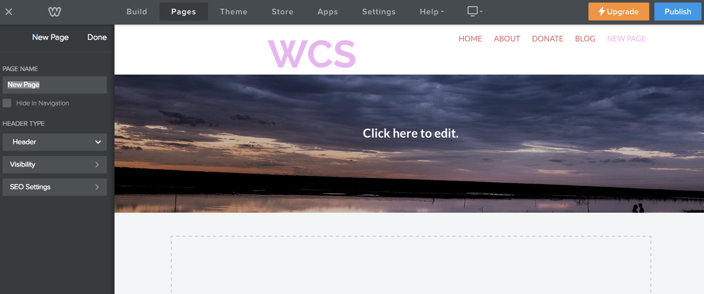
- Header: Contains a title bar area with navigation, a header area with a banner image where site owners can add text, and a content area below that.
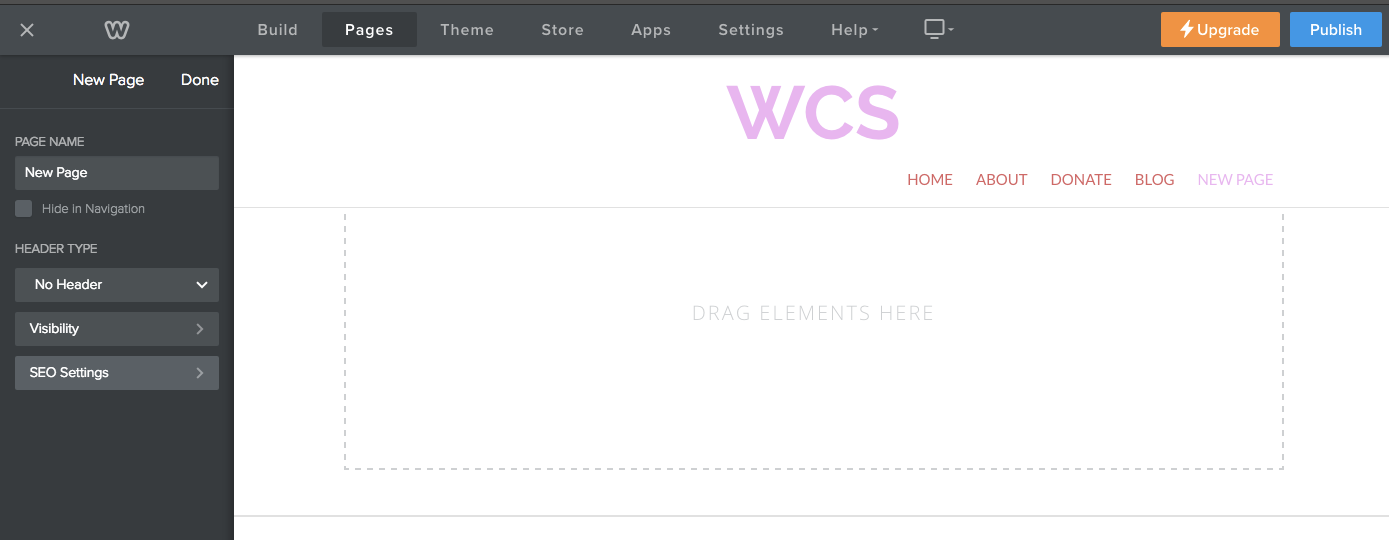
- No Header: Doesn't have a header area with a banner image. Only the title bar area and content areas display.
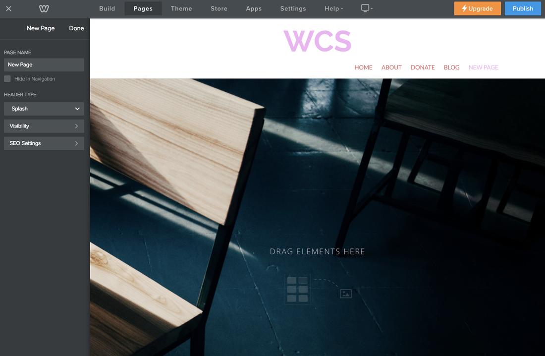
- Splash: Doesn't have a content area and the banner image is the full size of the page.
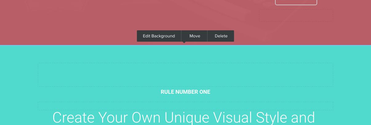
Within the header, you can add an area that allows the user to change the background or layout without having to touch the code.
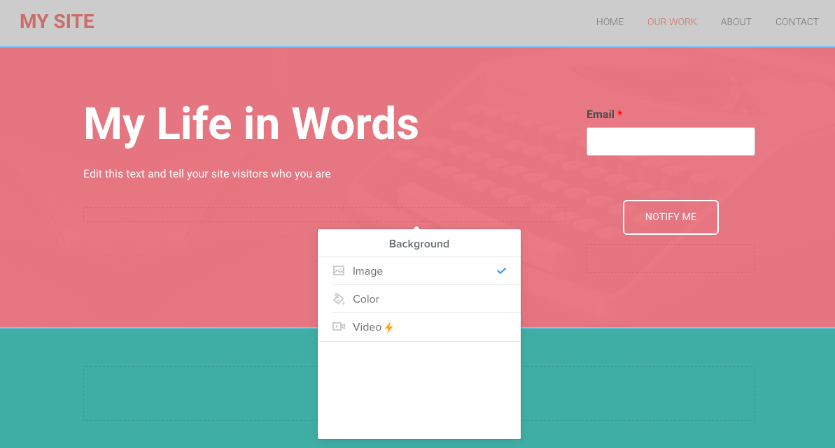
Within the body, you can add a section and the user can then change the background and layout and move or copy the section without the need for code.
You build headers and sections in the HTML templates.
Element Guidelines
Weebly elements are what the user drags and drops onto the page to create HTML components. Often, these elements present the user with choices about how they want that element to display. For example, line dividers can have different widths. Forms can have different input elements. Your theme needs to account for each of these setting variables.
Follow these element guidelines when creating your theme.
Follow these element guidelines when creating your theme.
Display Size
Weebly websites are viewed on all sorts of devices - from phones to desktops. You need to make sure your theme looks great on all of them. We recommend designing for the following display sizes:
If your theme is responsive, you should also style for these respective breakpoints. Weebly normally uses the following:
- Mobile: Less than 768 px
- Tablet: 768 - 992 px
- Desktop: 992-1200 px
- WidescreenDesktop: Greater than 1200 px
If your theme is responsive, you should also style for these respective breakpoints. Weebly normally uses the following:
- Breakpoint 1: 1024 px (widescreen screens)
- Breakpoint 2: 992 px
- Breakpoint 3: 767 px
- Breakpoint 4: 480 px (smaller mobile screens)
Colors
Colors are very important in determining the look, feel, and versatility of your theme. There are two optional ways you can offer color versions for your theme: color palettes and variations.
Color Palettes
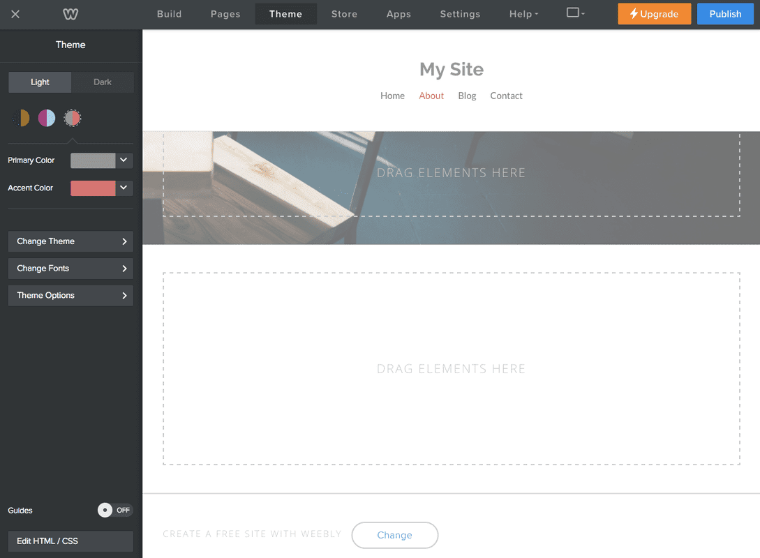
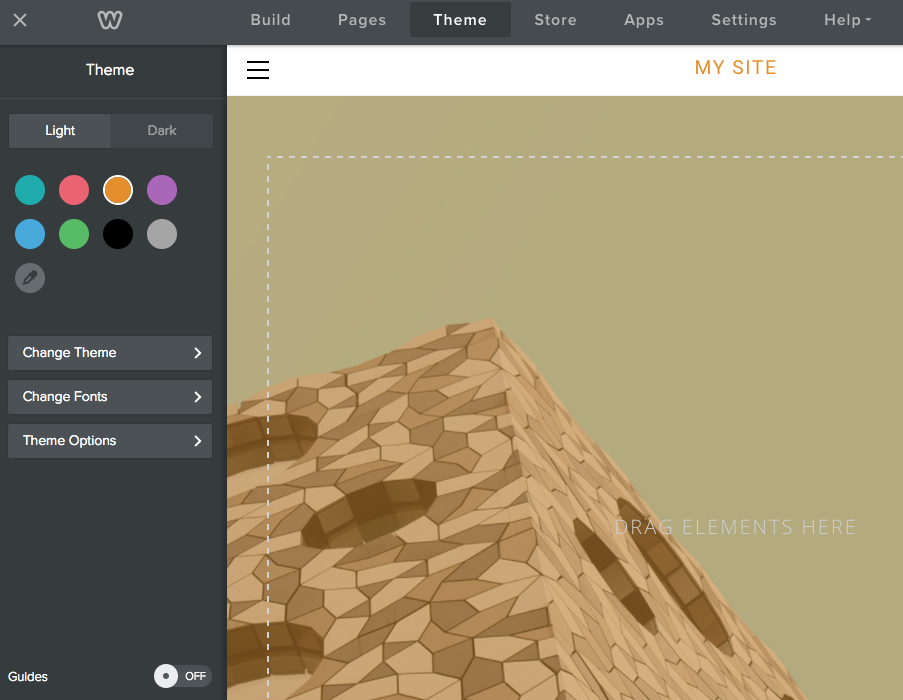
Color palettes allow the user to select up to two color choices for their site: a primary color and an accent color. Users can choose the colors, allowing them to better personalize and brand their site. If you want, you can create default palettes that have the primary and accent colors already defined.
Here's a theme with three default color palettes. Users click the dropper icon to select a different pair of colors if they don't want to use one of the defaults.
As the theme developer, you decide where those colors are used. You might also use LESS color operation functions to create variations on those colors throughout the theme. For example, you might use the primary color for titles, H1 headings and backgrounds, and then a tint of that color for other headings. And you might use the accent color for buttons and links, and then a shade of that color for visited links.
When you activate color palettes, you can choose to have just a primary color or both a primary and accent color. For example, the Brisk theme has only a primary color defined.
Color Variations
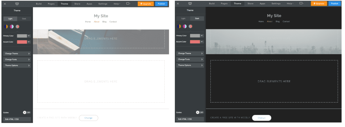
You might also want to provide a light and a dark variation of the your theme. These variations allow you to color aspects of your theme other than where a primary or accent color is being used. For example, the light variation might use a white background on a header, while the dark version uses a black background.
You can also use color variations to create different color schemes for your theme. As with palettes, you determine what aspects of the theme changes when a variation is chosen. For example, you might decide that the background, link, and button colors will change.
For example, the Venue theme has four color variations.
Create color variations when you want to provide multiple, but fixed, color options for your theme. But remember, with color variations users can't pick the colors they want. They have to choose from the variations you provide.
Use color palettes when you want users to be able to determine the main color scheme used for their site.
Check out our resources page for sites that can help you with deciding on color palettes for your theme.
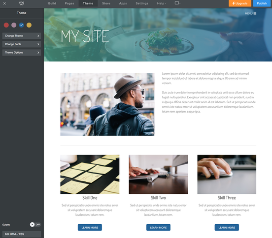
Images
When creating a theme, images often do the best job of selling your design. Because of this, you want to pick good ones. Make sure you understand the permission that comes with the photo(s) you decide to use. Our resources page lists a number of sites that offer free images.
You also need a screenshot of your theme in use on a site to be displayed in the theme chooser shown when users create a site or decide to change their theme. This screenshot needs to be a .jpg file and be 1590px wide, 894px high, with a DPI of 480.
You also need a screenshot of your theme in use on a site to be displayed in the theme chooser shown when users create a site or decide to change their theme. This screenshot needs to be a .jpg file and be 1590px wide, 894px high, with a DPI of 480.
Fonts
While Weebly users can use the Theme tab to change fonts for their site, you should still spend some time designating a few font choices. You can select as many base and accent fonts as your design requires, but we do recommend that you keep your fonts choices to a maximum of 3. Most text elements on a Weebly page will be some variation of an H2, paragraph, list, link, or a block quote.
Similar to images, fonts have their own set of permissions for distributing to third parties. For this reason, we strongly suggest using Google Fonts for your themes, as these are available to redistribute.
Similar to images, fonts have their own set of permissions for distributing to third parties. For this reason, we strongly suggest using Google Fonts for your themes, as these are available to redistribute.
Browser Support
Weebly sites and the editor support Internet Explorer 11 and later, as well as all current versions of self-updating browsers. Make sure to test accordingly, both in the editor and in a published site.