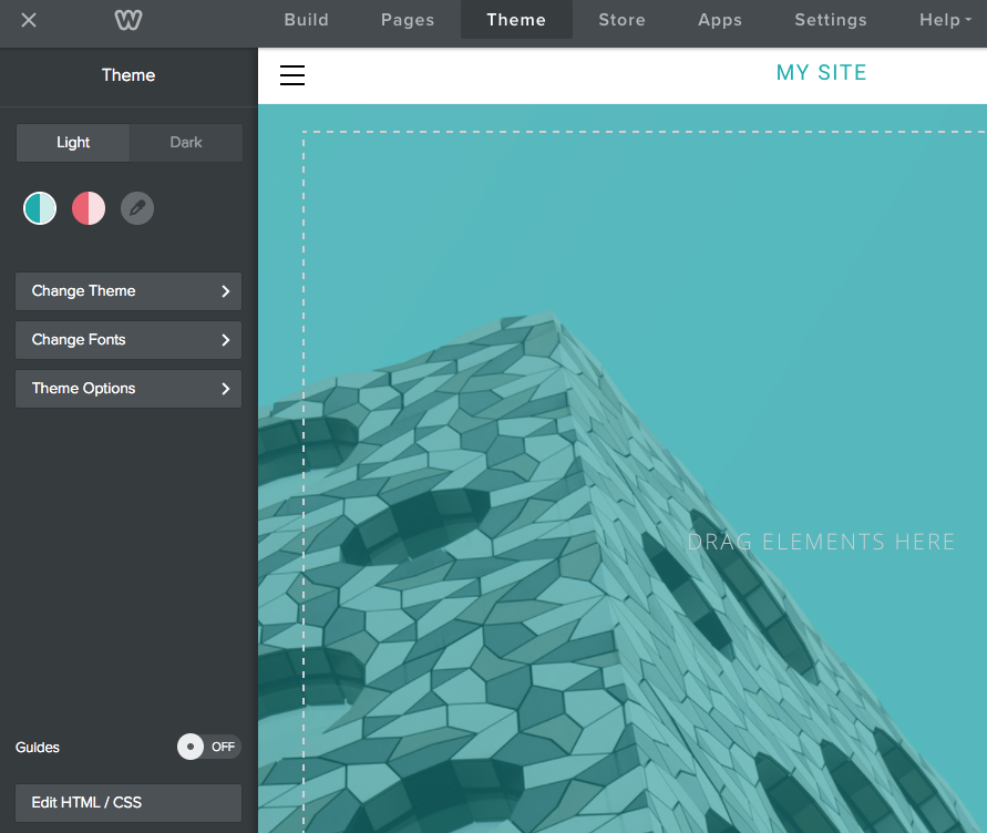
Create a Color Palette
You can create a color palette for your theme that allows the user to select a primary and an accent color for the site. You can provide one or more default palettes that users can choose from or they can create their own.
For example, this theme offers two palettes and the user can create their own by clicking the eyedropper icon.
For example, this theme offers two palettes and the user can create their own by clicking the eyedropper icon.
You create palettes by defining variables in the theme's manifest that are used in the LESS stylesheets.
Note: Color palettes are only supported using LESS. You cannot use color palettes with CSS.
In this topic:
Configure a Color Palette in the Manifest
You create a color palette by turning on the feature and then optionally defining colors in one or more palettes.
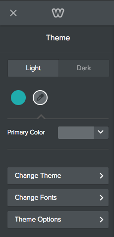
To allow a palette for your theme, add the color-support element to the theme's manifest and determine if you'll support a primary and an accent color or just a primary color.
To allow a palette for your theme, add the color-support element to the theme's manifest and determine if you'll support a primary and an accent color or just a primary color.
Color Palette Support in the Manifest
Adding this support creates the dropper icon that allows the user to create their own palette. Supporting just a primary color means the user can only choose one color. Supporting both allows the user to choose a color for both. This image shows support for just a primary color:
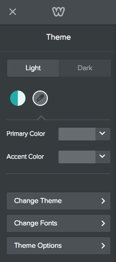
This theme allows both a primary and accent color:
Optionally create a default palette by defining a primary and/or an accent color within an array of palette colors (a palette must be in an array even if there is only one).
Add a Palette to the Manifest
You can create as many palettes in the array as you'd like.
Once the palette(s) are defined, they display in the sidebar where the user can choose one or create their own. If you don't create a palette, (but do add the color-support element), then only the eyedropper icon displays, allowing the user to create their own palette.
Using Color Palettes in LESS
Once you define a palette(s), you determine where those colors are used in the theme. You use these LESS variables as placeholders for the colors. That way, when the user selects one of the palettes, or creates their own, the right color is used:
For example, if you want titles to use the primary color and buttons to use the accent color, you might add the following to your main.less file.
- Primary color: @site-primary-color
- Accent color: @site-accent-color
For example, if you want titles to use the primary color and buttons to use the accent color, you might add the following to your main.less file.
You can use LESS color operation functions to provide variations on the primary and accent colors, while still keeping within the palette. For example, you might set h2 to be a slightly lighter shade of the primary color using the tint function:
You can find more about using LESS color operations functions here.
To provide more color flexibility for your palettes, you can create a dark and light version. Follow the procedures for creating color versions, using the palette variables in versions' LESS file. Name the light version variables_light.less and the dark variables_dark.less.
To provide more color flexibility for your palettes, you can create a dark and light version. Follow the procedures for creating color versions, using the palette variables in versions' LESS file. Name the light version variables_light.less and the dark variables_dark.less.