Progress Component
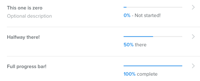
The Progress component displays a completion percentage. The image below shows three Progress components displaying different percentages of completion.
In this topic:
Progress Properties
The Progress component (type = progress) uses the following properties:
Property |
Type |
Description |
Required? |
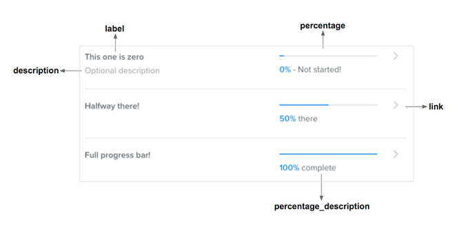
label |
String |
Text displayed as a title |
yes |
description |
String |
Text displayed below the label that describes the progress. |
no |
percentage |
Integer (between 0 and 100) |
The percentage that determines how far to fill the progress indicator |
yes |
percentage_description |
String |
Description displayed under the progress indicator and next to the percentage value. |
no |
link |
URL |
URL to the content that displays in the takeover when the component is clicked. Must be served over HTTPS. Can include a JWT token. |
no |
This graphic shows how the properties are used to display the Progress component.
Here's an example of the JSON to display the Progress component.
JSON Example of a Progress Component