Create the HTML Layout Templates
You implement one HTML template file for each of the header types your theme will support (header/no header/splash). Every template file must contain the foundation code and the mandatory theme tags used to insert content. We provide optional tags to pull in other pre-defined content, and you can create custom tags to denote additional areas where users can add content. You can also optionally create a header area and sections that allow your users to change the background, the layout, and for sections, the ability to copy and move them.
You can use existing HTML from another theme, or you can create your own from scratch. Make sure that your stylesheets support all styles that you use in the HTML.
You can use existing HTML from another theme, or you can create your own from scratch. Make sure that your stylesheets support all styles that you use in the HTML.
In this topic:
Create an HTML Template File
You need to create one template for each of the following header types that you want to support:
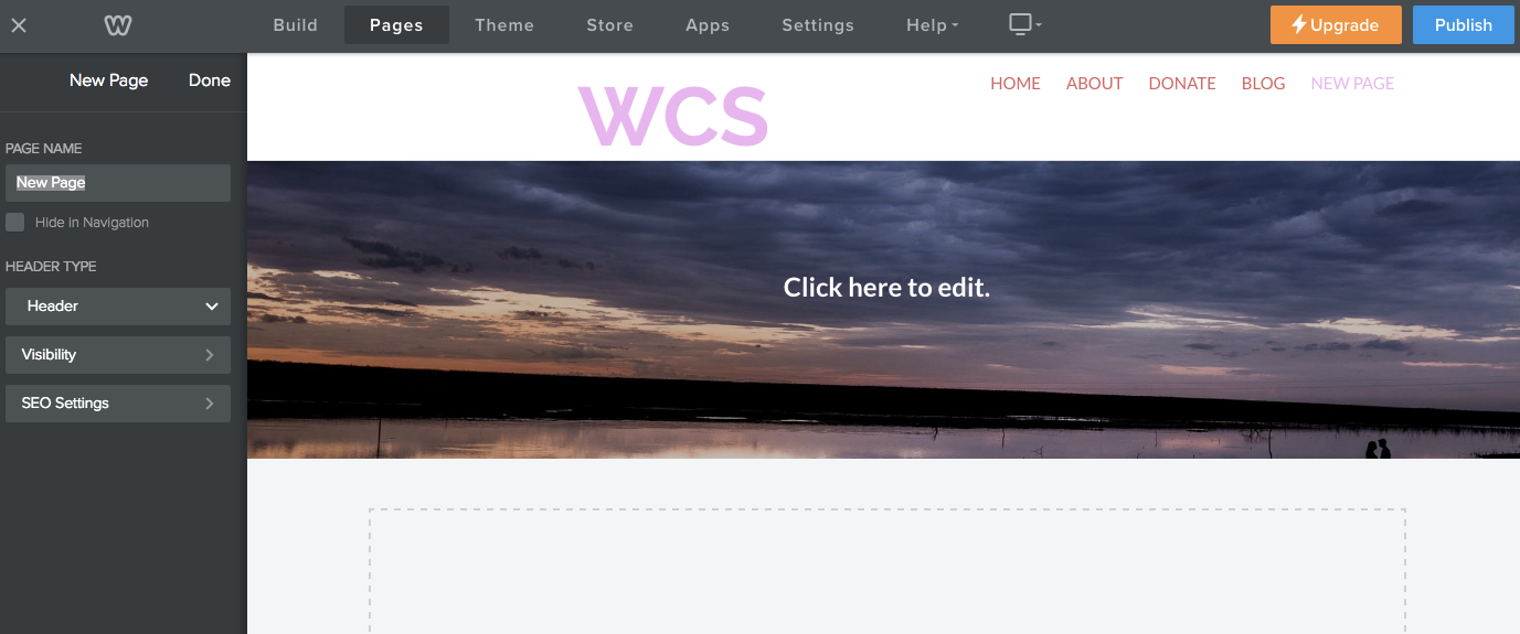
- Header: Has a title bar area with navigation and title/logo above a header area that normally consists of a banner image or video. The content area displays below the banner image.
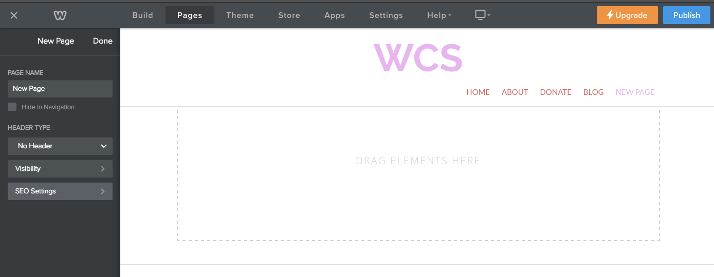
- No Header: Doesn't have a header area with a banner image. Only the title bar area and content areas display.
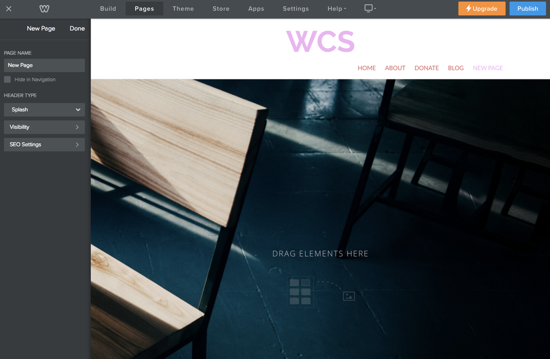
- Splash: Doesn't have a content area and the banner image is the full size of the page (content can be added on top of the banner image).
You can either create a template file by modifying an existing template, or by creating a new one.
To modify an existing template, simply open it in the Code Editor. To create a template from scratch, in the Code Editor, click the + icon next to HEADER TYPE and choose New Header Type. A file opens in the editor with the mandatory theme tags. You must add the foundation code and the code to display the mandatory tags (below). Click the Settings icon to set the name of the file, or to delete it.
You can also work externally and upload your template. Click the + icon and choose Upload Header Type(s).
The Foundation
Every page type needs the basic foundation code, shown below. Give the body tag the class that reflects that page's type:
For example, the sample below shows the foundation for a header template.
- Header: header-page
- No Header: no-header-page
- Splash Page: splash-page
For example, the sample below shows the foundation for a header template.
Foundation for Short Header Template
If you are creating your theme using an existing theme as a base, be sure you don't remove any of the foundation code.
Mandatory Theme Tags
All Weebly themes need to include the following tags:
Where you place these tags and how you style the generated content is up to you. If you create a new file (and aren't editing one from an existing theme), then these are added for you.
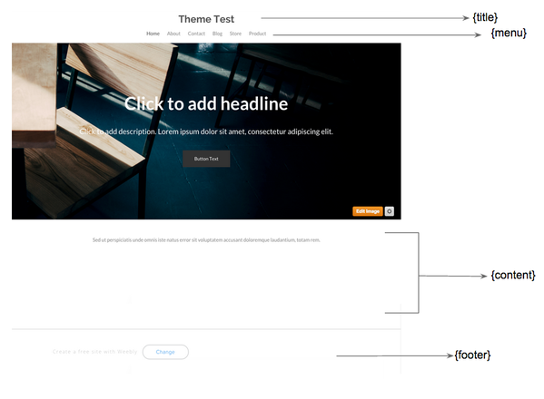
- {title} or {logo): Use {title} to display only the title of the site. Use {logo} to allow the site owner to decide whether to use the title or a logo file that they will upload.
- [menu}: Displays the pages in the site
- {content}: Displays the main content on the page. Much of this content is handled by partials.
- {footer}: Displays footer content at the bottom of the page
Where you place these tags and how you style the generated content is up to you. If you create a new file (and aren't editing one from an existing theme), then these are added for you.
Note: The editor adds the {title} tag, but you can replace that with the {logo} tag if you want.
This graphic shows where these tags are used in the Base theme:
Here's the code from the Base theme showing the mandatory tags:
Mandatory Tags
Optional Tags
If your theme supports social icons, search, and phone number/text using options, then you need to add these tags:
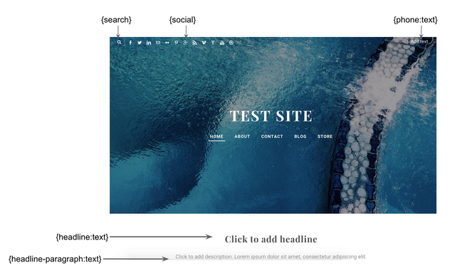
This graphic shows where these tags are used in the Impact theme.
- {phone:text}: Displays the text "Add Text" that the user can click to edit.
- {social}: Adds the ability to display social icons. The user can click the area to configure the icons to display.
- {search}: Displays the search icon.
- {headline:text}: Displays placeholder text in a headline font that the user can edit/replace.
- {headline-paragraph:text}: Displays placeholder paragraph text.
This graphic shows where these tags are used in the Impact theme.
Note: Site owners need to explicitly turn options (phone, social, search) on using Options. Search is only available in paid sites.
Here's code showing how these tags are used in the Impact theme.
Optional Tags
We also provide these predefined tags for you to use:
- {action:button}: Adds a button. The user can edit the button text and set the link, spacing, and button style.
- {minicart}: Relocates existing store minicart element from its default placement in the navigation bar. A wrapper populates with the class name wsite-custom-minicart-wrapper.
- {membership}: Relocates existing log in/log out element from its default placement in the navigation bar. A wrapper populates with the class name wsite-custom-membership-wrapper.
- {subtitle:text}: Adds a subtitle text / slogan.
- {sidebar:content}: Adds a sidebar to the website.
- {address:text}: Adds address fields.
By default, all tags show the same content on every page that uses this template's header type. However, you can allow unique content on each page by specifying the global="false" attribute. For example, if you use the {subtitle:text} tag, by default whatever the user enters for that text on one page appears on all pages that use that same header type. Instead, if you set it to global="false", then they can set different text on each page.
Custom Tags
You can use the tags below to create custom-named areas where users can add content not covered by the predefined tags. Substitute area-name with a more meaningful word.
For example:
- {area-name:text}: An area that holds text
- {area-name:content}: An area to drag content elements into
- {area-name:image}: An area that holds an image
Be sure to include size constraints, for example {area-name:image max-width="200" max-height="200"}
For example:
Custom Tags
You can also use the global="false" attribute for these tags. Don't forget to update your stylesheet to style these tags.
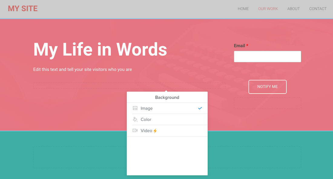
Add a Header Area
A header area is an optional area in the header that a user can configure as needed. When a user clicks into a header area, a popup menu displays and they can change the background image, color, and optionally add a video (if on a premium plan).
To add a header area, add the {{#header}} tag at the end of the main banner-wrap div, as shown in the following code:
Header Area Code
Use the container class to style as needed.
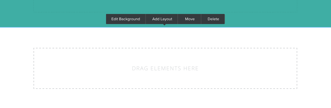
Add a Section
Sections are optional areas where a user can drag content, allowing pages that use the same template to appear quite different, just by adding and designing sections. With sections, when the user clicks on the main content area, a popup menu displays showing options for designing the section. The user can also drag the blue outline to change the height of the section.
To add a section to a template, add the {{#sections}} tag shown in the following code where you want the content to appear. The .container class can be used to style the section, for example to set max-width and centering of the sections.
Section Code
Design for Mobile
Most Weebly customers will want their website to work on desktop and mobile devices. Make sure that you handle displays on these smaller screens appropriately.