Step 4: Create Variations of the Theme
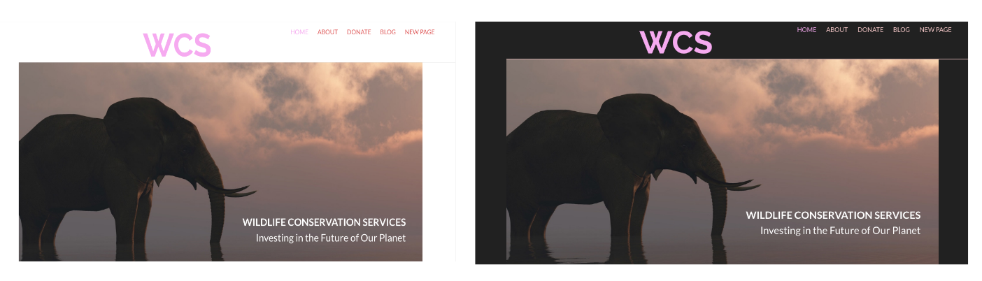
Variations allow you to control certain color aspects of a theme (unlike palette colors, users can't pick their own colors). The Base theme has a light and a dark variation. The light variation uses a white background in the header and the dark variation uses black.
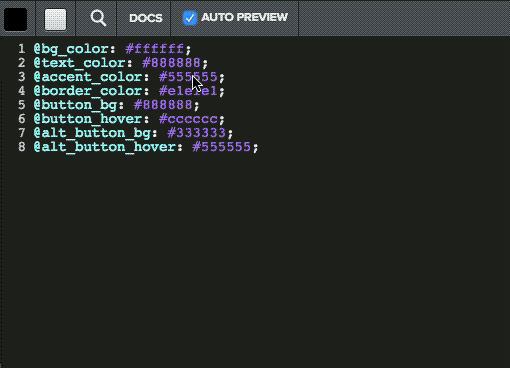
Each variation uses it's own LESS file to define color variables, which are then used in the main.less file. For example, the Base theme's variation LESS files have variables for the background color (@bg_color), the text color (@text_color), and an accent color (@accent_color). Here's what's in the variables_light LESS file:
In the main.less file, those variables are used to style HTML elements. For example, the body element is styled using the @bg_color variable:
When a user selects a variation, the body element uses the background color defined for that variation. Because background color in the variables_light file is @bg_color: #ffffff;, when a user chooses that variation, the background color is white.
Let's use the primary and accent color we just created in the variations. Let's have text use the primary color and let's change the color currently defined for the accent color to use our palette's accent color instead.
Let's use the primary and accent color we just created in the variations. Let's have text use the primary color and let's change the color currently defined for the accent color to use our palette's accent color instead.
- If you're not in the Code Editor, from the Theme tab, click Edit HTML/CSS.
- Under the STYLES directory, open the variables_light.less file.
- Change the @accent_color variable definition to be @site-accent-color.
4. Change the @text_color variable to be @site-primary-color.
5. Open variables_dark.less file and make the same edits.
6. Click Save.
In the Theme tab, click on the Dark variation.
It's really hard to see the dark purple text when using the dark variation, so let's lighten it up. Instead of using a different color, let's just lighten the variable by 50%. That way, if the user changes the primary color in the palette, the new color will still be used, but it will be light enough to see on a dark background.
- Open the variables_dark.less file and replace the value for the @text_color variable with lighten(@site-primary-color, 50%);
- Click Save and note that the color is now lighter.
- Go ahead and create another palette as a user might, by clicking in the blank circle and using the dropdowns to create different primary and accent colors and notice how the theme changes.
What Just Happened?
You created a light and dark variation of the theme. The title and navigation links are now using the palette colors. Let's see why.
Reopen the editor (click Edit HTML/CSS) and open the main.less file. This file holds the styles for the theme. Scroll down to the Text and type area and note that body text color is using the @text_color variable, so now it will use our primary color. And links are using the @accent_color variable, so they will now use the accent color from the palette.